Mosaic Design System
Product
Duration
Tools
My Services
Design System, SaaS Platform in Supply Chain & Procurement
2019 – Current
Figma, Zeroheight, Adobe CC, Pendo, Jira & Claude Design
Visual Design, Branding, Research, Prototyping, Accessibility, Tone of Voice, Animations, Documentation & QA
Team
My Role
Company
Audience
Jaggaer
Principal UX Designer
1 Designer, 3-5 QA & 10+ Engineers
Product Designers, Engineers, Product Managers, Product Owners, Software Tester & Customer Success Manager
One System. Endless Experiences.
A comprehensive and scalable system to drive efficiency, champion accessibility, and establish a cohesive, consistent foundation for a highly configurable product.
Design System Impact
8k
Internal Design System Views 2025
Production Ready Components
20+
Targeted Solutions
32
Our component library includes 32 reusable components built for consistency and scalability.
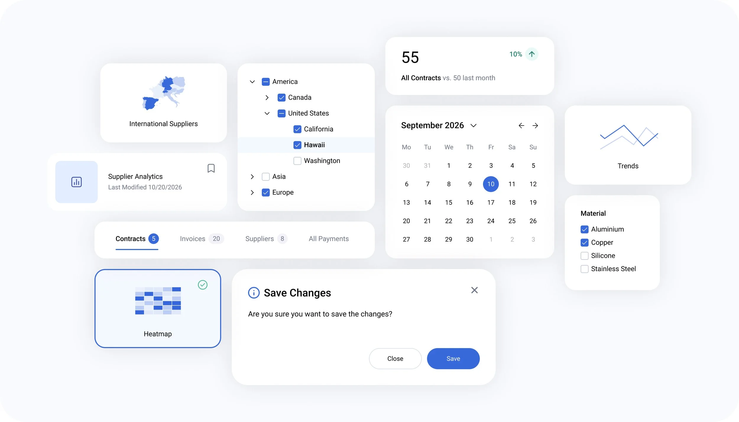
Understanding the Ecosystem
Shortly after joining the company in 2019, it became clear that a major challenge awaited us. Multiple recent mergers had brought together disparate tech stacks and design patterns, with little documentation. Siloed teams, limited design resources, and outdated tools added to the challenge, and that’s where the journey started.
From fragmented platforms to one unified experience, Mosaic.
Introduction
Users faced an inconsistent and fragmented experience as the product team began integrating multiple legacy platforms, resulting in a disjointed interface and overall experience.
Users encounter multiple interface versions within a single workflow.
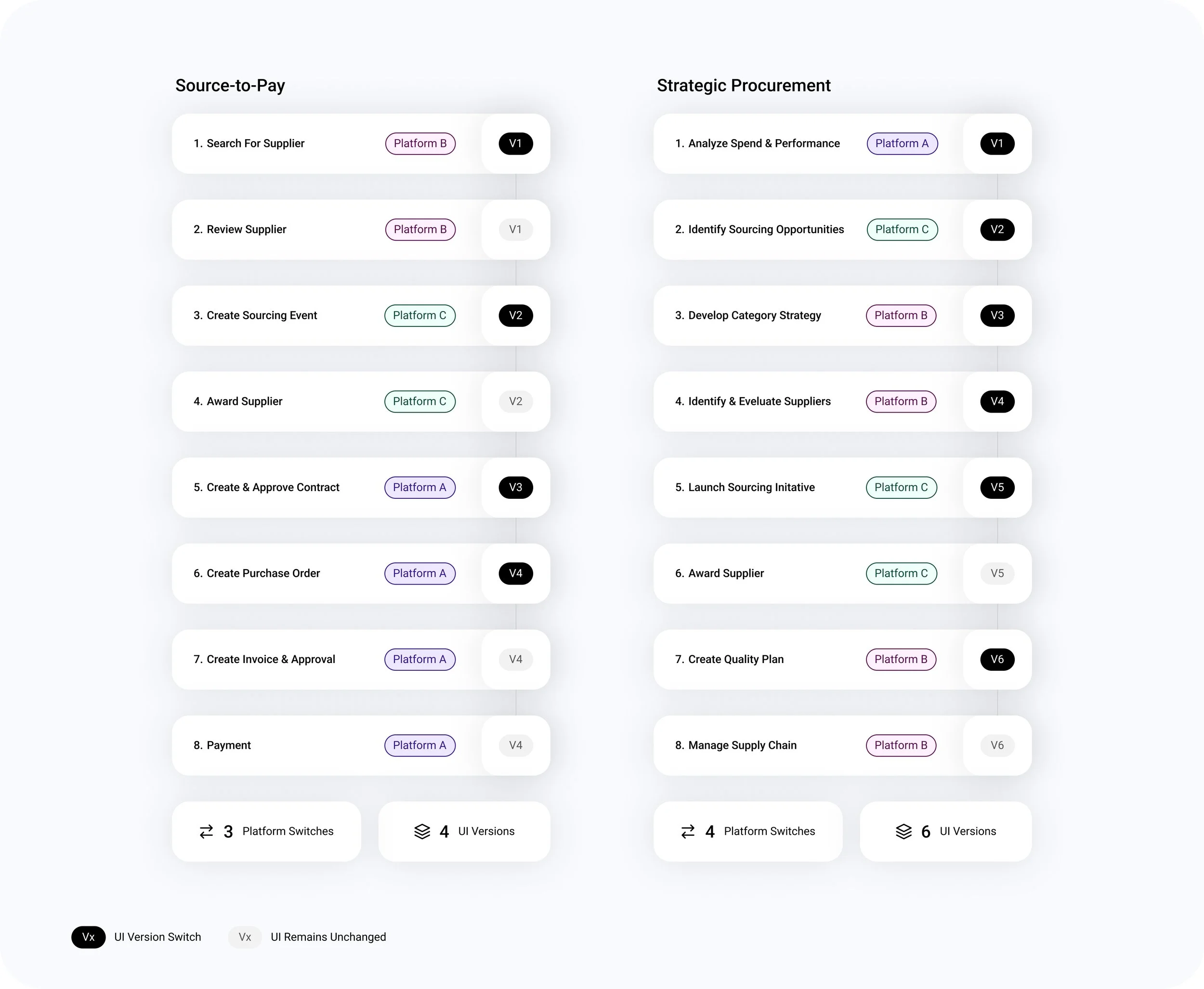
Two user workflow examples spanning multiple interface versions.
Problem Statement
Structural Challenges
Despite having no dedicated design team, designers were distributed across teams and supported over 300 engineers, leaving little time for documentation. As demand grew, I successfully advocated for a design system, a dedicated team, and additional design resources.
Challenges
Platform Challenges
Building a cohesive platform across multiple tech stacks was a challenge. Additionally, inconsistent adherence to accessibility standards and white-labeling requirements became critical issues the design system needed to address.
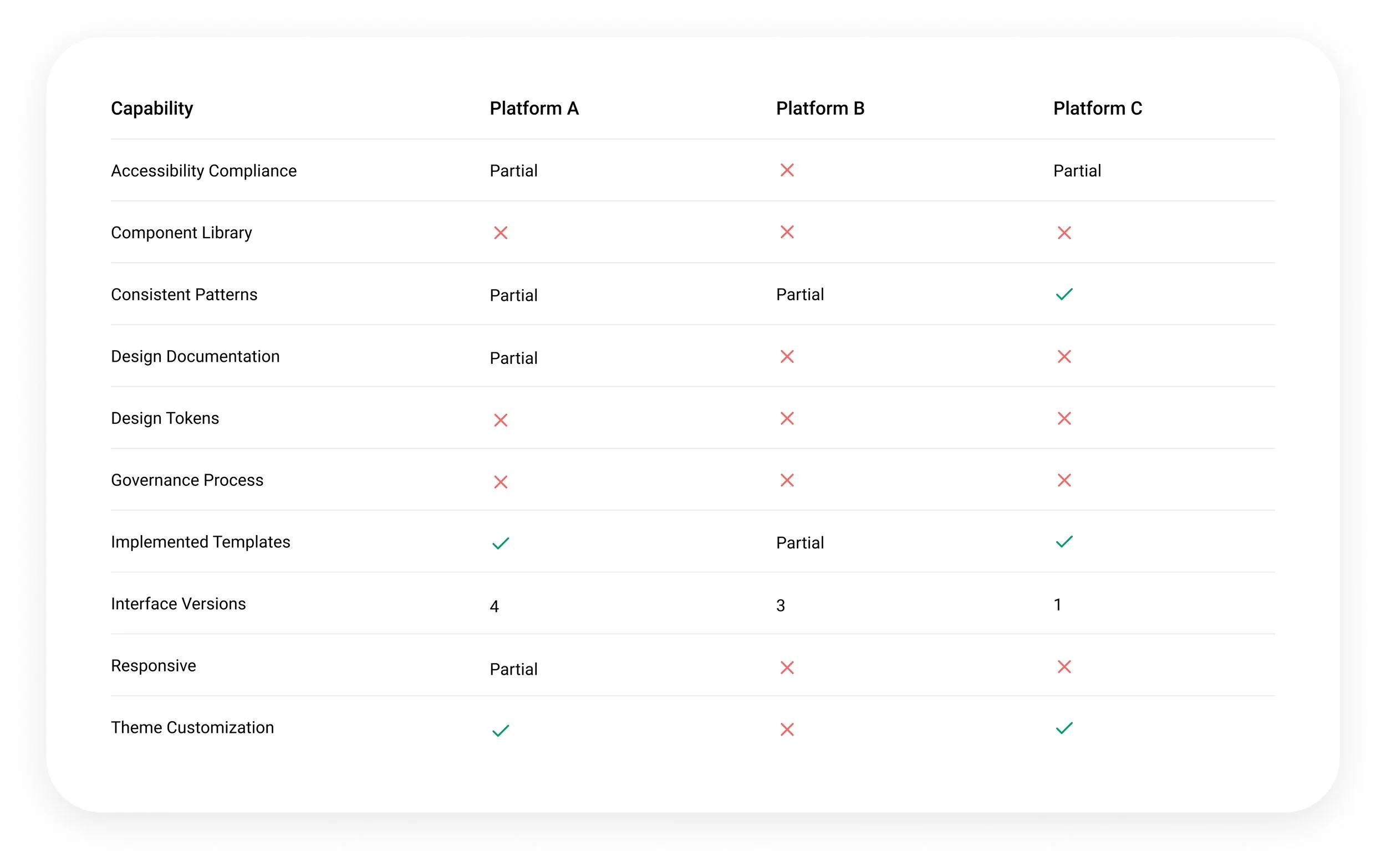
Platform observations from 2019, prior to the introduction of the Mosaic Design System.
Consistency
Essential for seamless navigation across our platform.

Scalability
Maintains a cohesive experience as products and features evolve.
Accessibility
Ensuring the platform can be used by everyone, regardless of their abilities.

Efficiency
Enables faster iterations and easier updates across multiple touch points.

Flexibility
Built to adapt to evolving technologies, platforms & user needs.


Simplicity
Clear and intuitive designs make interfaces easier to navigate and use.
Design Principles
The design system was guided by six core principles that established a shared foundation for creating a user-centered experiences across the product ecosystem.
Discovery
Product Audit
Built a comprehensive component inventory across all platforms to understand usage, coverage, and variation.
Audited over 2,000 icons across five platforms.
Evaluated the color system, component library, and interaction patterns.
Reviewed information architecture and navigation across products.
Key Insights
Observed significant inconsistencies existed across foundational components such as badges, buttons, and more.
Identified over 80 gray variations within a single platform, highlighting the absence of color governance.
Found substantial variations across core interaction patterns, including navigation, toolbars, tables, forms, filters, and messaging.
Standardized 200+ badge and 160+ button variations into scalable, accessible systems with consistent semantics and visuals.
User Research
Launched a Design Partner Program to conduct recurring customer interviews and collect continuous feedback on evolving user needs.
Facilitated Design Jams with cross-functional teams.
Benchmarked leading design systems to identify best practices.
Key Insights
Frustrated customers caused by by variations in interaction, patterns and visual design across products.
Research revealed accessibility compliance as a non-negotiable requirement for public sector organizations.
Similar usability challenges emerged across industries.
Leading design systems shared principles adaptable to our ecosystem.
One of many complex interactions refined into a simpler experience.
Actions
Defined the core building blocks and design tokens of the design system.
Preserved familiar interaction patterns and visual elements to reduce disruption during product migration.
Created centralized documentation and reusable design assets.
Introduced the design system incrementally across products to support adoption and continuous improvement.
Established accessibility as a core design principle aligned with WCAG and Section 508.
Base organizes, semantic defines, component applies.
Mosaic Design System
Grid
Typography
Color Palette
Showcasing distinct solution identities and how they come to life within the navigation.
Established a flexible branding framework that allows individual solutions to maintain their identity while remaining part of a unified platform experience. Persistent branding and a solution switcher help users maintain context and move effortlessly between connected solutions.
Solution Branding
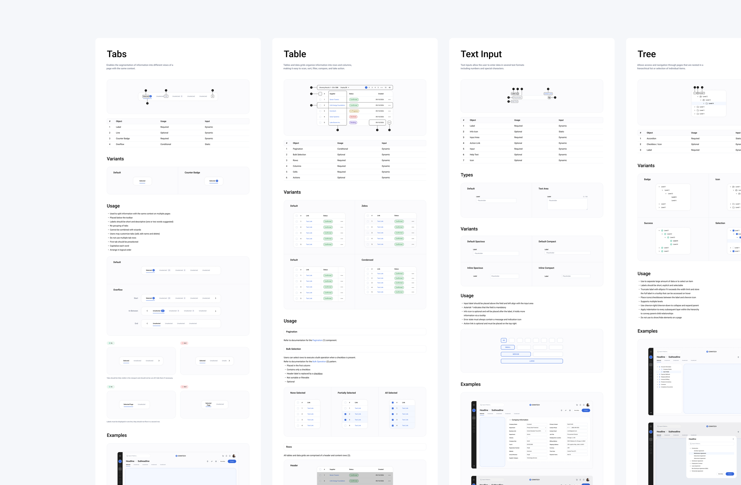
Created and maintain a scalable component library with a comprehensive documentation in Zeroheight and shared Figma libraries, providing a single source of truth for designers and developers.
Components
A consistent grid and clear rules ensure a cohesive, scalable icon set.
Building a cohesive icon-kit and significantly reducing the icon number from 2000+ to 280 is one amongst many areas that allow to support bringing consistency across the platform.
Consistency
Core platform templates including dashboards, data grids, forms, and status pages.
By identifying our most used page templates including dashboards, data grids, and forms we improved flexibility and consistency while streamlining design and development workflows.
Templates
White labeling helps customers deliver a seamless, branded experience.
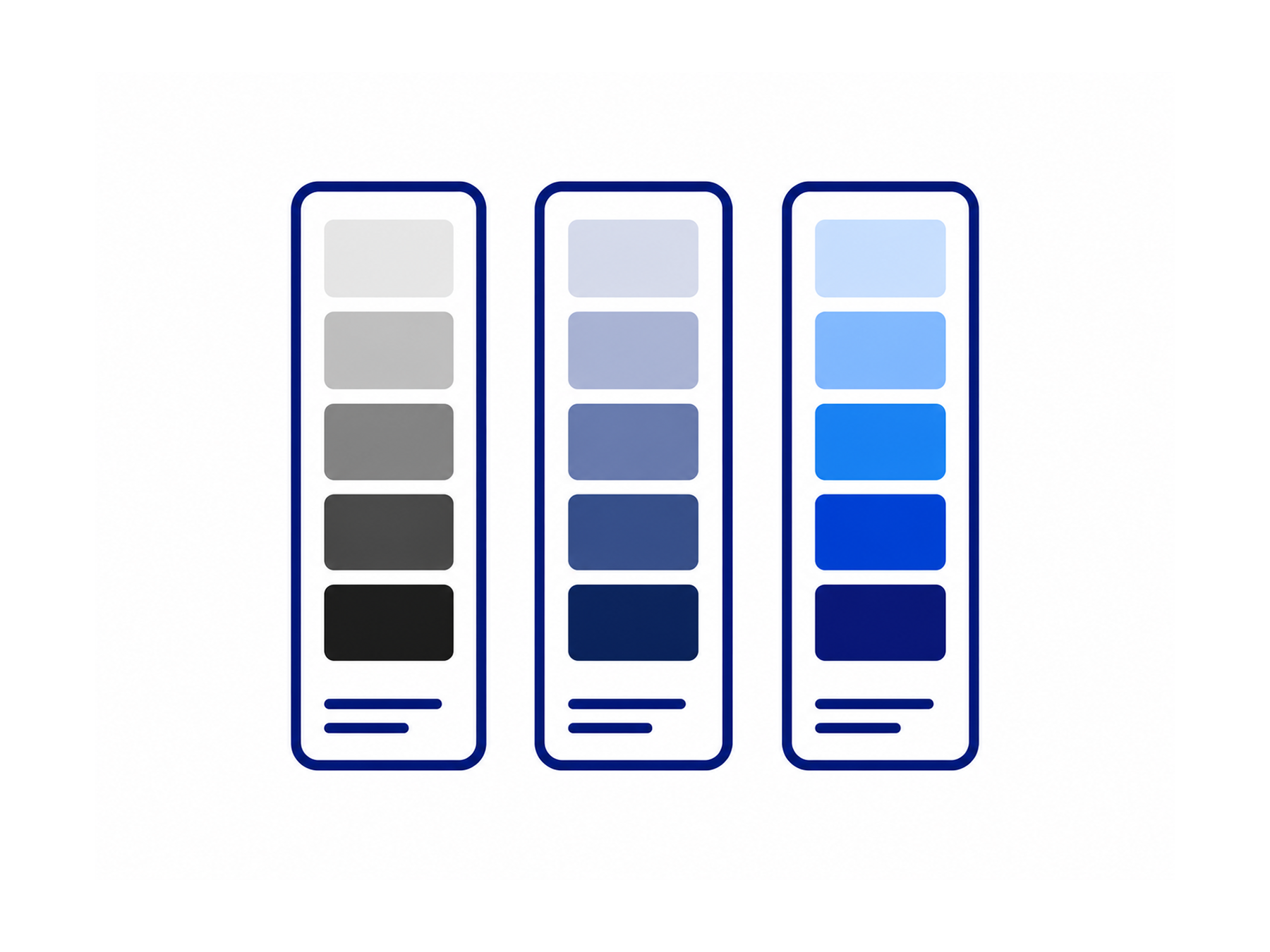
Crafting a neutral color palette for UI elements to be mindful of customers who white-label our platform.
The tertiary color palette is strategically reserved to intentionally highlight certain elements such as actionable items, different states such as success, warnings, errors, as well as for data visualization.
Adaptive Visual Identity
Mosaic is committed to delivering an accessible user experience, particularly vital for its public sector and higher education clients who must meet regulations like Section 508 in the U.S.
Accessibility spans visual, keyboard, and screen reader usability, requiring thoughtful attention to color contrast, text scaling, zoom, semantic structure, labeling, focus states and more. Motion is used minimally, recognizing that animations can adversely affect users with sensory or neurological sensitivities.
Collaborating with partners like Criterion and Level Access, along with accessibility experts from our client teams, enables continuous validation of components and patterns, helps address user challenges, and provides customers with transparency into our compliance status through a VPAT.
Accessibility
Beyond the Desktop
While desktop remains the primary platform, we established responsive guidelines to support accessible experiences across all screen sizes.
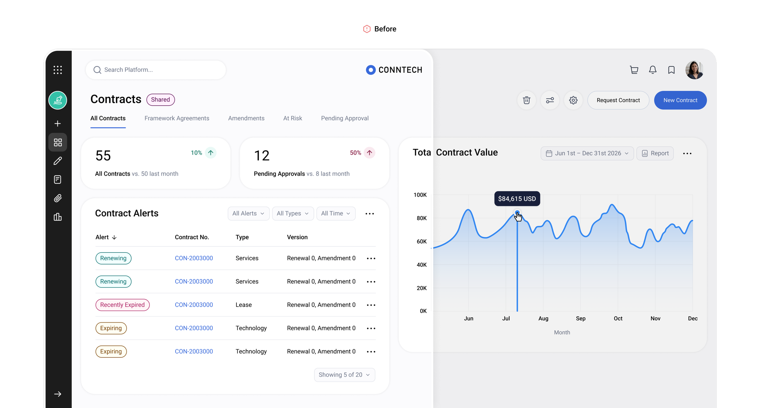
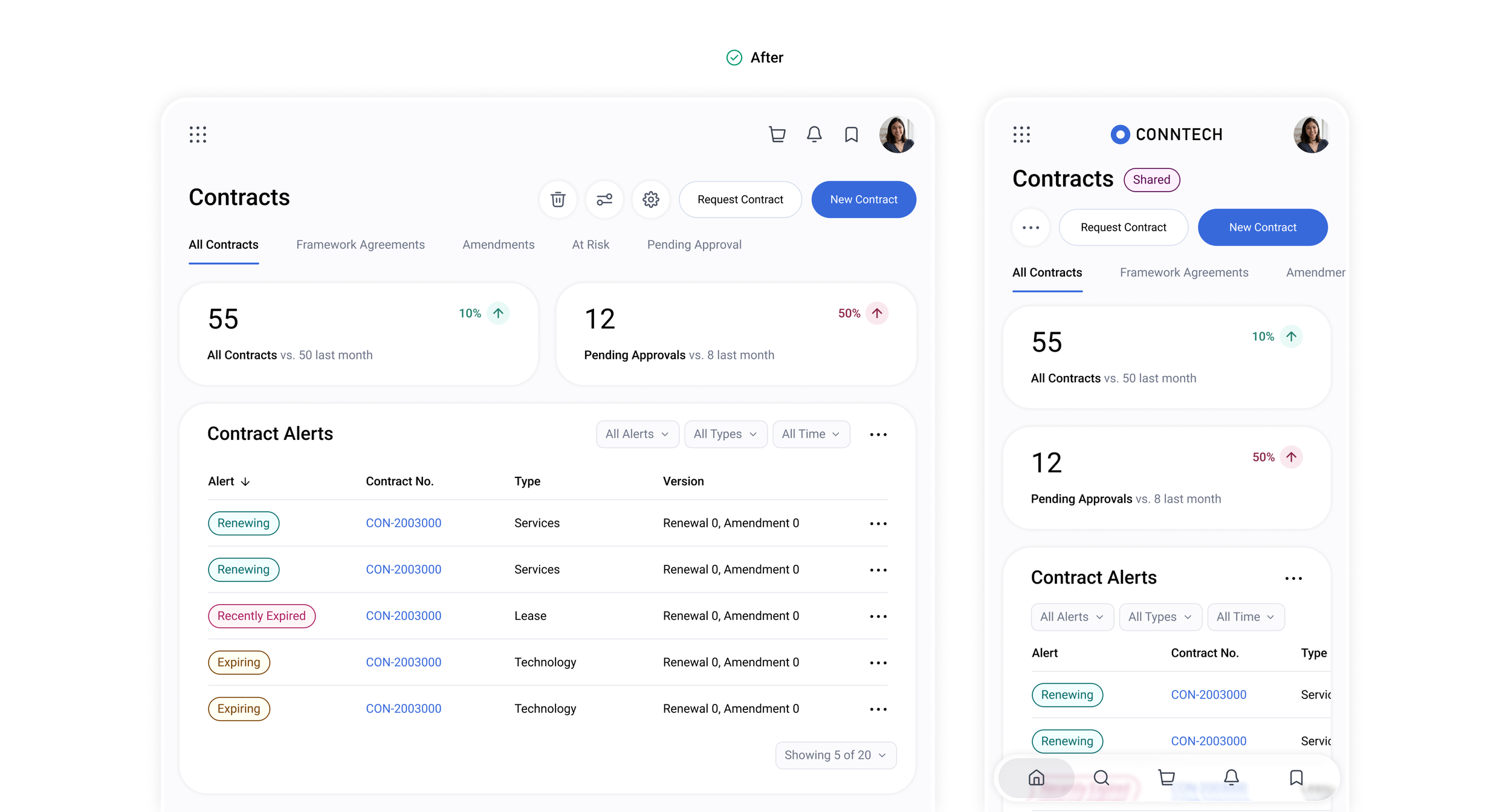
One experience, optimized across screen sizes.
Governance & Growth
AI-Assisted Design
Data & Analytics
Automation & Workflows
I own the end-to-end management of our design system, from component libraries in Figma to documentation in Zeroheight and the delivery of production-ready components.
This includes defining visual direction, creating and maintaining components, managing release notes, communicating updates across teams, and ensuring alignment between design and development.
Showcasing a subset of our comprehensive Mosaic Design System built with Zeroheight.
Ownership
The design system acts as a centralized internal resource for design and development standards. While not publicly available, adoption has grown from around 300 to 8,500+ views over four years, reflecting its value as a shared source of truth across the organization.
To ensure scalability and future-readiness, our team actively assess emerging AI tools and workflows such as Claude Design, Figma Make, and Windsurf.
Scalability
Centralized at its core, collaborative by design.
Continuous Evolution
The destination stays clear, even when the course changes.
Building Mosaic reinforced that a design system is never truly finished. Its success depends on continuous feedback, collaboration, and the ability to navigate changing product and user needs. The journey taught us to balance standardization with flexibility, adjusting the course when needed while keeping the shared foundation and destination clear.
Future opportunities focus on expanding adoption, streamlining contribution processes, and continuously improving the system based on real-world use.
Lessons Learned
-
![]()
Where
-
![]()
Source to Pay